

Stash's brand was suffering from an identity crisis. Their visual system had spent the last 5 years splintering, as the needs of a quickly growing company continued to spiral. Cohesion frequently shifted, lacking a clear target market and crystallization of the meaning they were trying to represent.
2020 found us at a watershed moment—with an imperative to build solid brand foundations for the next few years of growth. It was time to focus and clarify our brand vision, identity, and storytelling to propel us to the next level. We quickly got to work refining our brand strategy and in some ways, trying to go back to the simplicity of our roots.
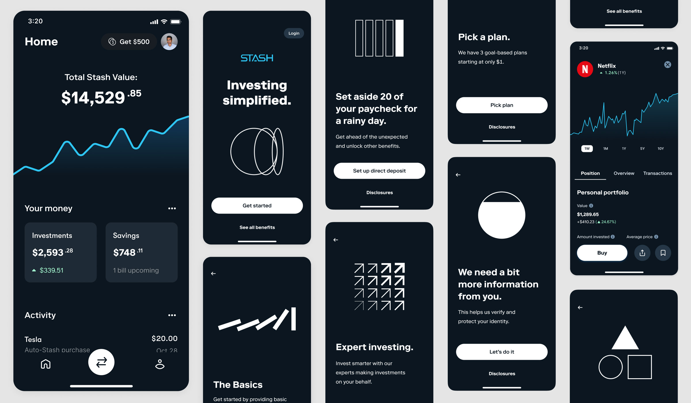
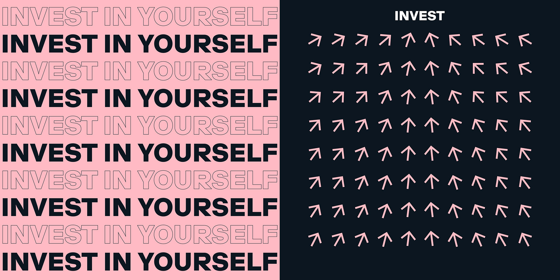
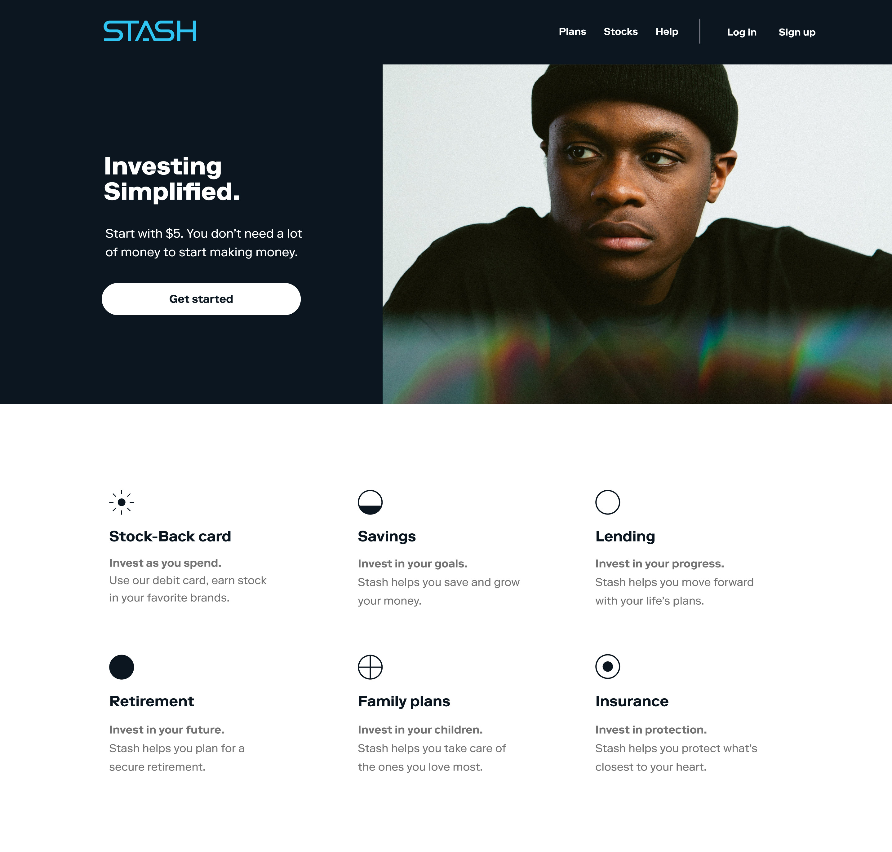
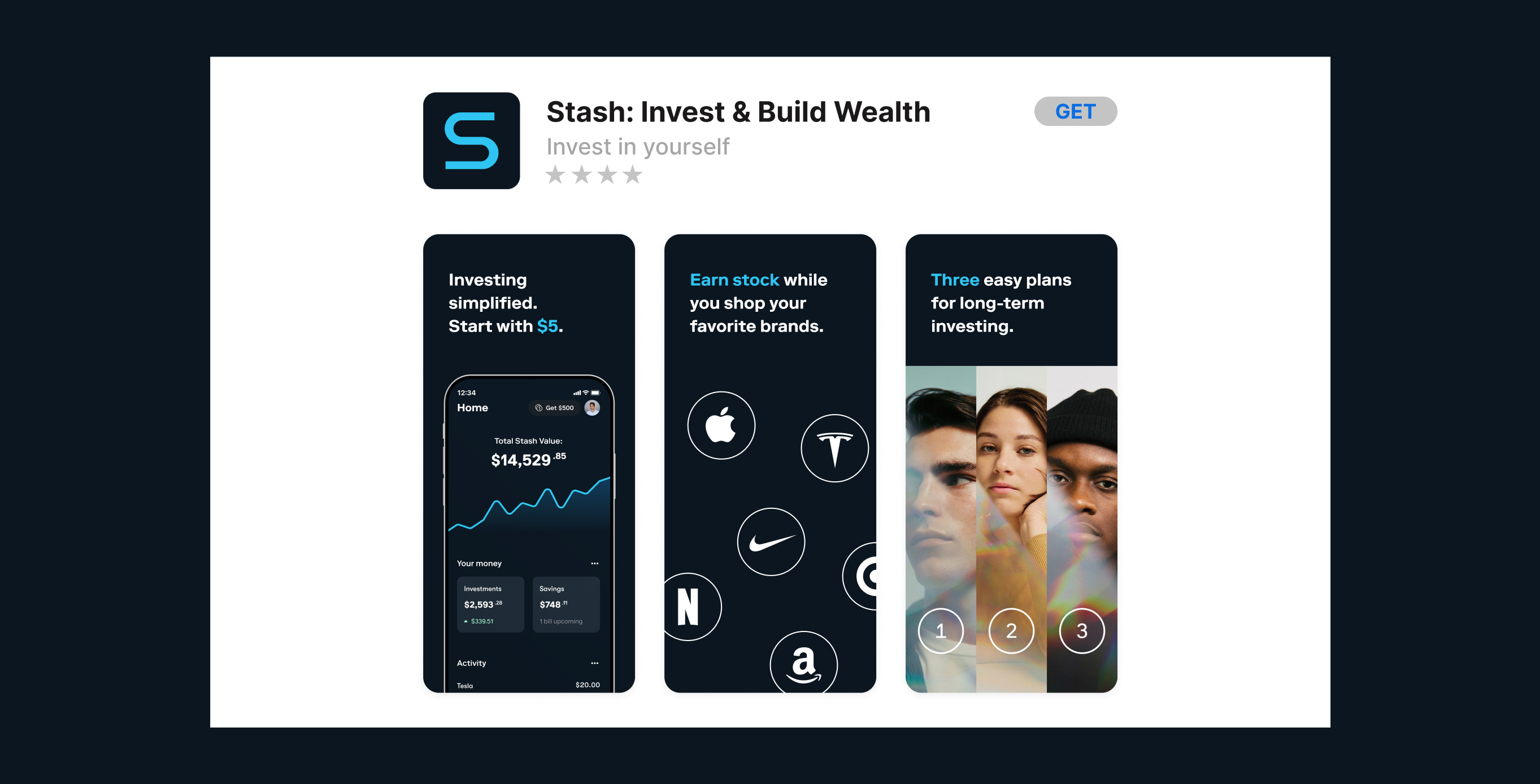
On the visual side, we took an evolutionary approach—not revolutionary—in order to maintain connective tissue to where we came from. Using a clean and modern aesthetic, we began to find ways to re-energize our brand—striving to convey greater maturity, while still exuding a youthful spirit. Enhancing our gravitas to build continued trust, yet still feeling relatable by having a focus on emotion—further humanizing Stash and creating a sense of hope and possibility.
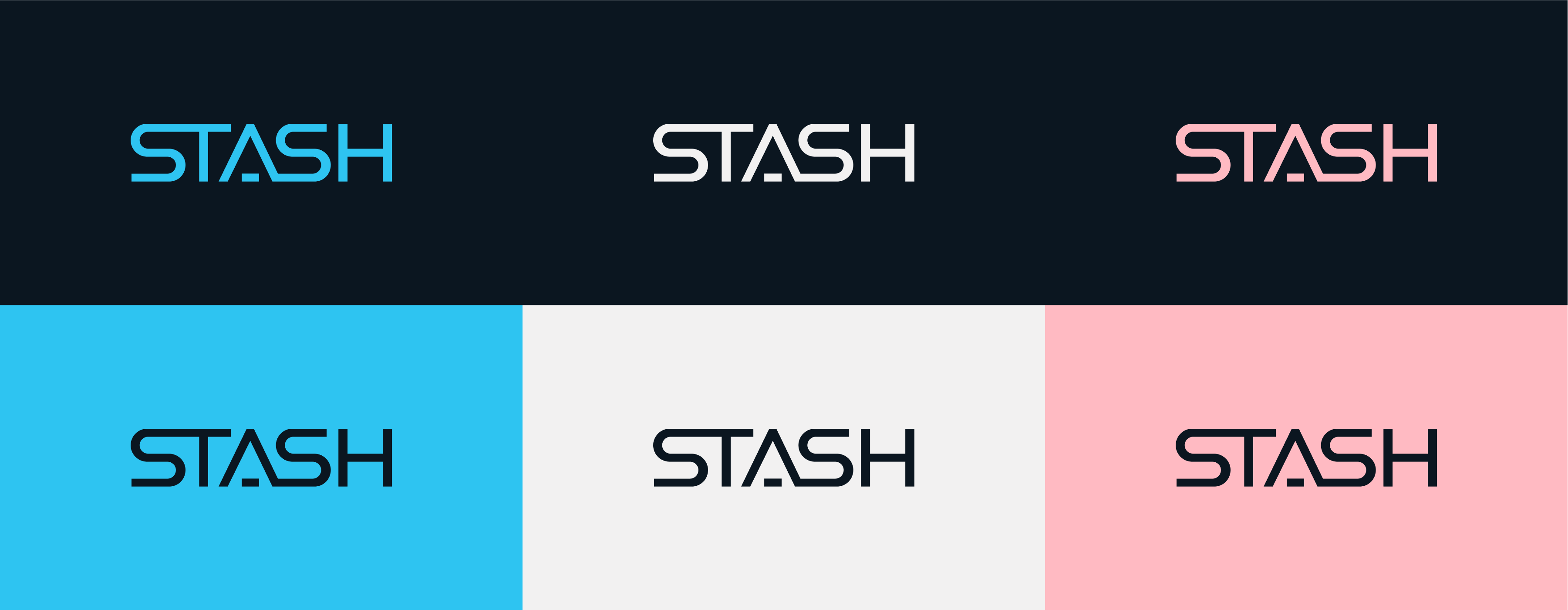
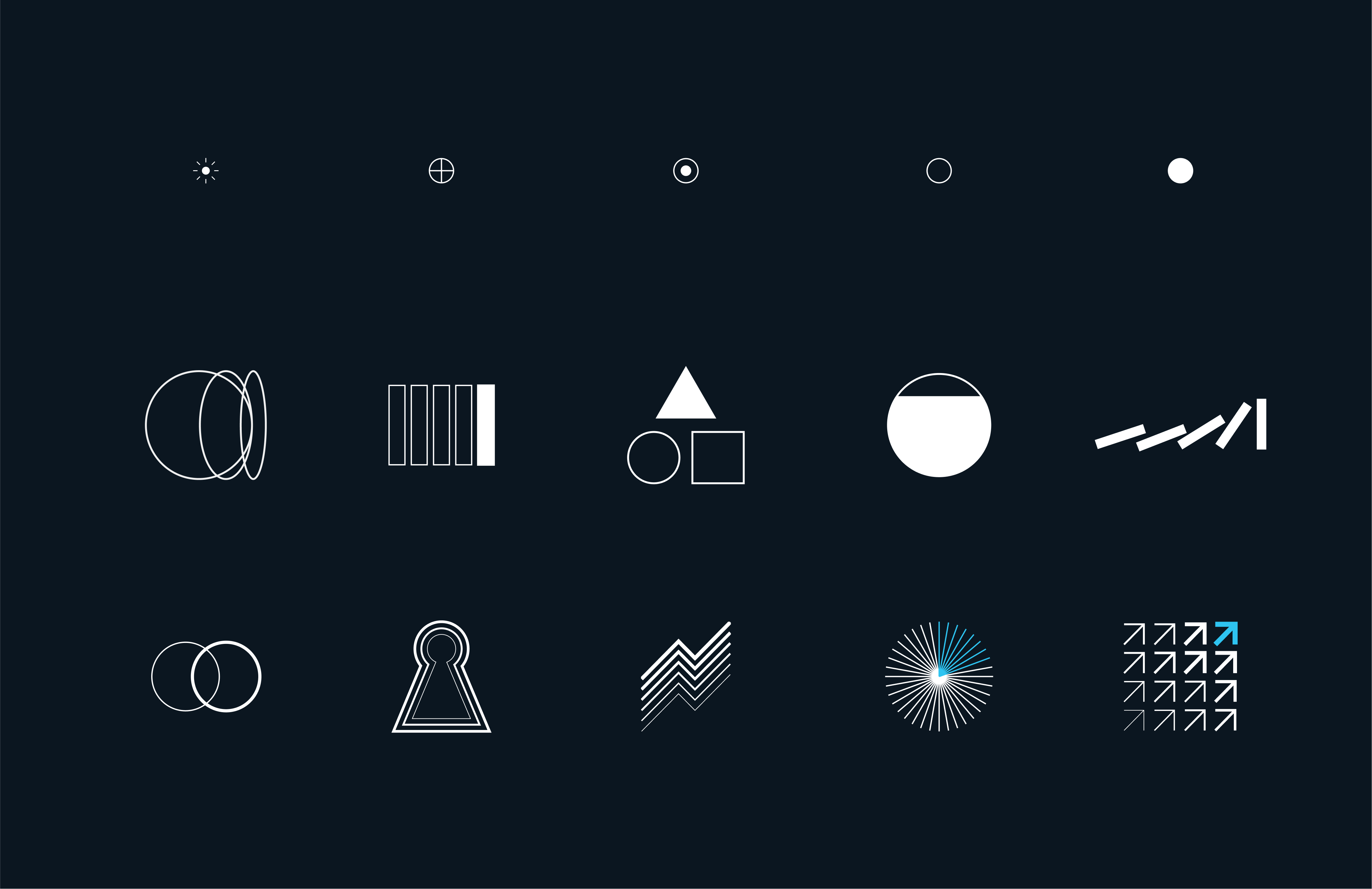
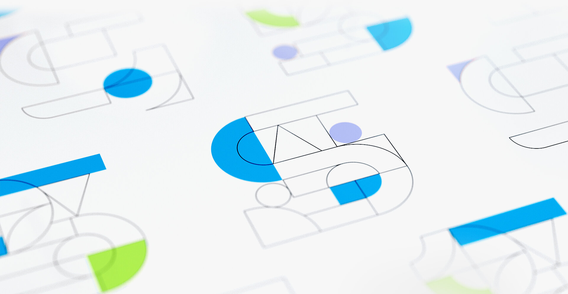
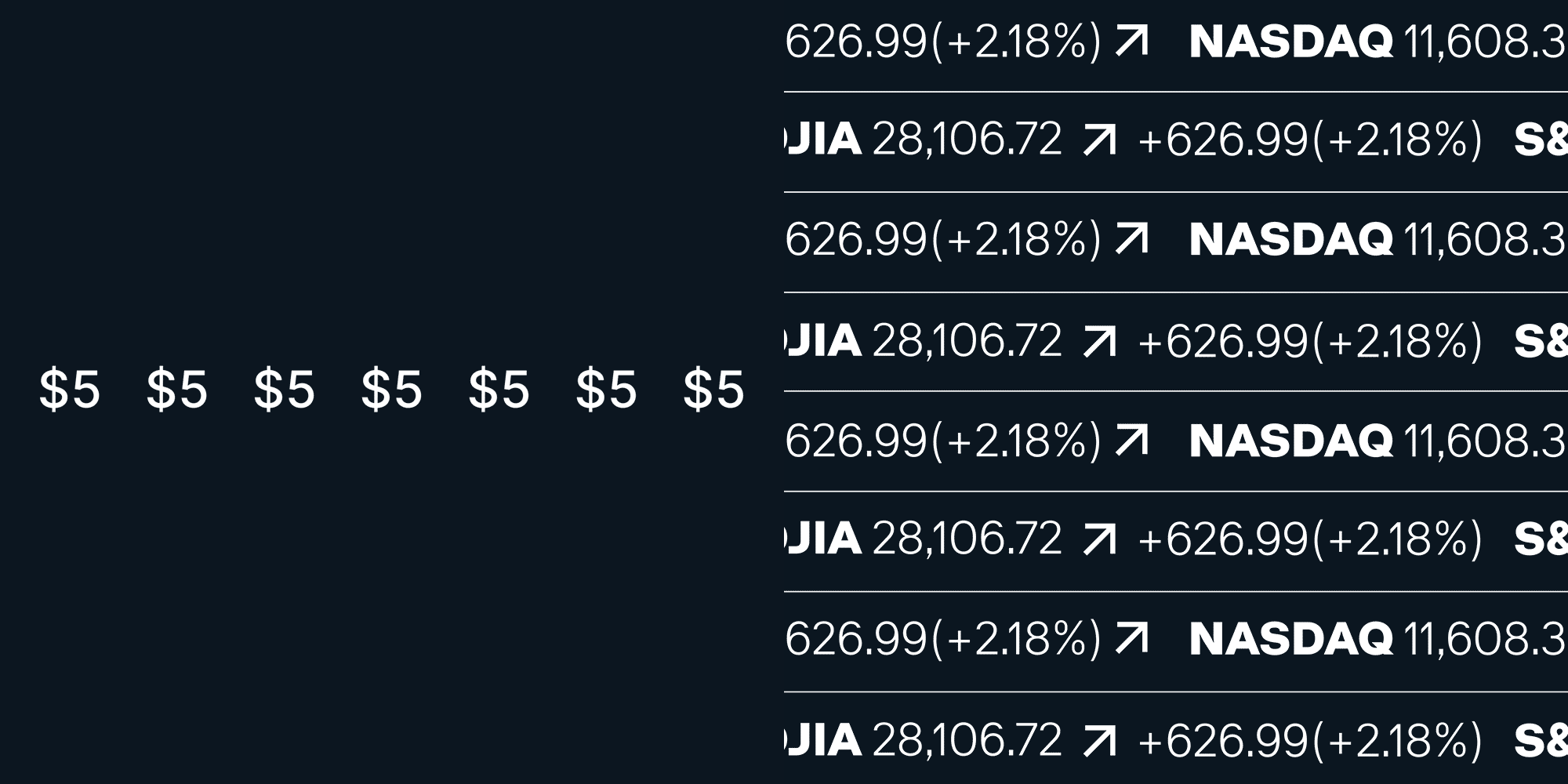
We adjusted our logo, pared back our color palette, and simplified our tiered system of iconography and illustration. From there, we began to experiment with dynamic motion design patterns. Finally, bringing everything together to establish a new baseline across all touch points from marketing to our digital product.


—
Copyright © 2024
Brooklyn, NY
—
Contact
evanbrock@gmail.com
—
Make great work.
Be nice to people.
—
Typeset in:
Monument Extended
Neue Montreal